

Groovy Brewing Co.
BRANDING, LOGO DESIGN, PRINT DESIGN, ILLUSTRATION | INSTRUCTION: JASON KERNEVICH | ILLUSTRATOR, INDESIGN, PHOTOSHOP, PROCREATE
Groovy Brewing Co. is a place where beer aficionados and live-music enjoyers alike can come together. It serves as a hub of community, arts, music, great drinks, and delicious vegetarian eats. Within this project, I designed Rhythm & Brews, a limited craft beer and concert series. This serves as a glimpse into some of the many types of beer and music that would be featured within the walls of Groovy Brewing Co.

1. Background
The idea for Groovy Brewing Co. began within many different conversations with my parents. My dad is a musician and my mom has been a healthcare worker for 34 years; with the state of healthcare today, and my mom’s own passions and creativity, she has been longing to start a new venture. For the past year or so, we’ve been bouncing around the idea of starting a business together, one that provides a much-needed sense of community, an artistic and musical outlet, and a place to get delicious plant-based food (all my vegetarians know, a salad and fries is delicious, but some more options for once would be appreciated). These discussions covered many ideas, such as an artist co-op, a café and music venue, a brewery, and more; although it’s still up in the air what direction my family will take (if we decide to take it), but I was greatly inspired by all of our conversations. Thus, I decided to create Groovy Brewing Co. for my semester-long project.

2. Process
The process for Groovy Brewing Co. and Rhythm & Brews started with a lot of research. I compiled a mood board filled with funky type, illustrations, and bold colors. With this inspiration from various logos, beer can designs, color palettes, and brewery interiors in mind, I began with establishing a list of deliverables:
Logo for Groovy Brewing Co.
Logo for Rhythm & Brews
5 beer can labels
5 tap handles
Food menu & draft list
3 concert posters
Instagram page with 12 posts
Beer glasses & coasters
Mural inside brewery

The Groovy Brewing Co. logo underwent a few weeks of research and tweaks; it started out channeling the bubbly, vintage script typefaces of the 1970s (hence the name Groovy Brewing Co.!). I hand-lettered each iteration of the word “Groovy”, and while there were some good ideas happening, it felt like the logo wasn’t as clear and legible as it could be (seen in the top left logo). To solve this, but still take a hand-lettered approach, I created a version with a “G” that wasn’t script (bottom left logo). I was happy with the legibility in this version, but missed the movement of the first iteration. The final resolution was displaying “Brewing Co.” on a waving banner to add that movement back into the logo. The final Groovy Brewing Co. logo recalls the bubbly script typefaces of the 70s while still remaining clear and easy to read.
With hand-lettering being an important part of the Groovy Brewing logo, I wanted to make the limited edition logo for Rhythm & Brews mostly typographic. I knew this logo needed to convey what Rhythm & Brews actually was, in addition to just displaying the name. Therefore, I took the approach of a badge logo that explains this is a “craft beer and concert series” presented by Groovy Brewing. The glass in the center is a tulip glass, which promotes the aroma and flavor of malty, hoppy beers.


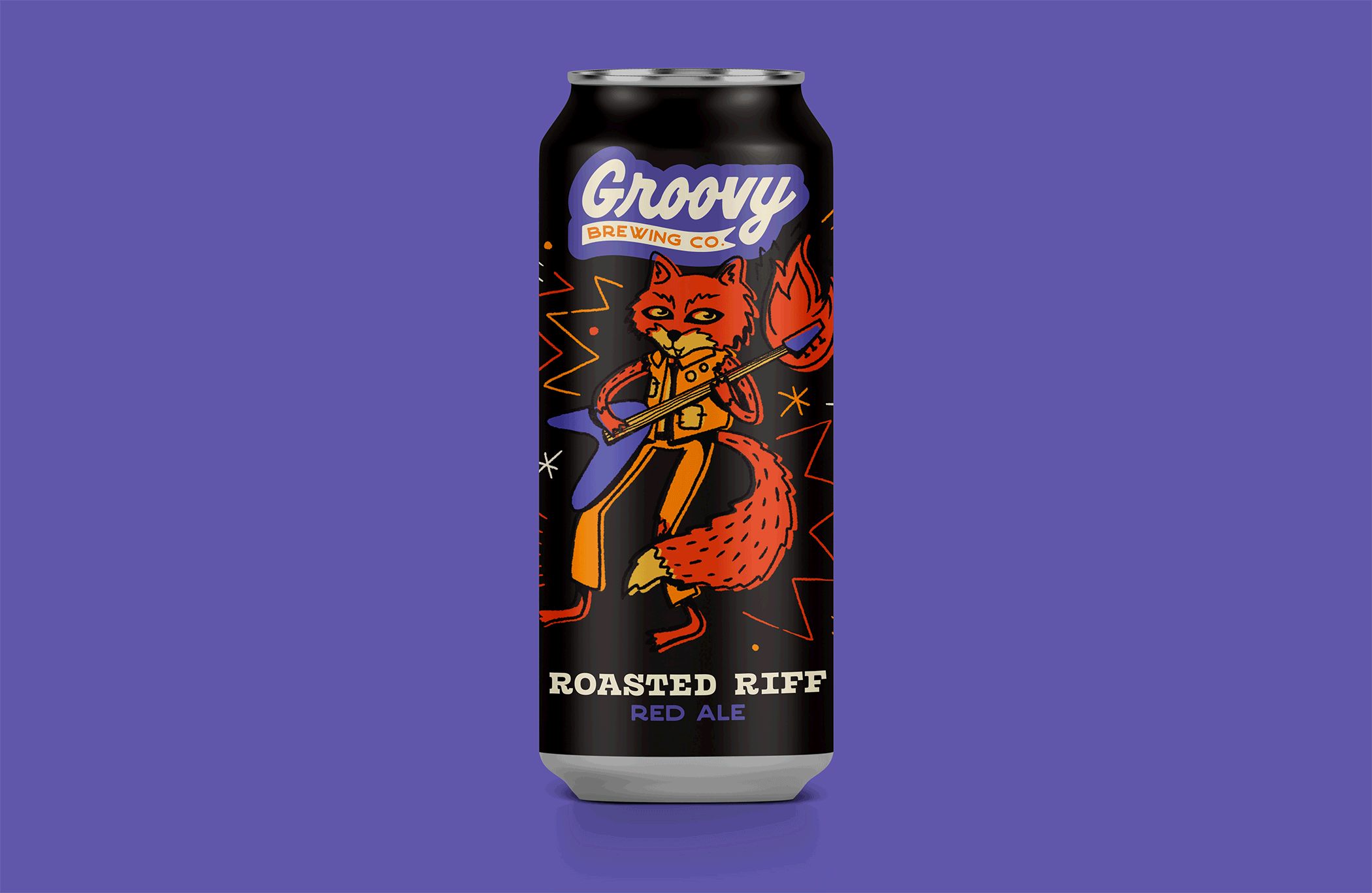
The beer featured in the Rhythm & Brews series are: Sweet Song Saison, Hoppy Horns Hefeweizen, Roasted Riff Red Ale, Aromatic Amp American IPA, and Prickly Punk Pilsner. I wanted the series to have a sense of whimsy, one that made looking at the can and drinking enjoyable to everyone, from a new beer drinker to the most sophisticated hipster beer lover. Each alliterative name correlated to an aspect of music, and I wanted to carry that lightheartedness into the character on each can. The original color palette (seen in the top set of characters) was very straightforward, and because of this, the cans didn’t work as well as a series as I wanted them to. In addition, I started out with four cans, but added one more so that the cans would look more cohesive and balanced as a set.
Through different trials, I landed on a color palette I was happy with; saturated greens, reds, purples, and oranges popped on the dark background and gave way to the look of Rhythm & Brews. By changing the colors in the Groovy Brewing Co. logo on each can, Rhythm & Brews felt like it had its own voice while still fitting into the overarching brewery identity. Inspired by the patterned accents on the cans, I then moved on to create patterns individual to each type of beer for the tap handles.
I was inspired by different elements of the flavor and name of beer when creating patterns for the tap handles. Through research of different hop profiles and ingredients, I decided upon the following symbols: barley for Sweet Song, hops for Hoppy Horns, fires for Roasted Riff, lightning bolts for Aromatic Amp, and prickly pear cacti for Prickly Punk. I utilized the pattern elements from each can to create new patterns for each handle that still felt related as part of a series.

The process of creating the menu and draft list was straightforward; I continued the use of the typefaces found in the logos and cans in order to create a cohesive brand identity across the board. The specialty draft list features a hand-drawn burst for the price, calling back to the hand done elements on the cans.
The food menu features all my favorite brewery food made vegetarian. I wanted to create a space where plant-based people could have not just one option, but the entire menu!

The concert posters also followed these typographic guidelines, this time allowing for more interesting applications of size and placement. I chose three of my favorite bands to play
in this fictional concert series, allowing me to use photographs I took at their concerts for the images on the posters. Through the editing of these photos – increased saturation and noise, and color adjustment to better fit the brand palette – I established a system of editing to be continued through the social media presence.

For my social media presence, I chose to make an Instagram page with 12 posts. After establishing a method of photo editing in the process of creating the concert posters, I was able to easily apply these to each image. I formatted the posters with the same typographic hierarchies to fit a square Instagram post, edited copyright-free images from Unsplash, and created mockups of beer glasses and coasters. With the aforementioned typographic and photographic guidelines, I created a unified social identity for Groovy Brewing Co. And Rhythm and Brews.
The mural was a fun final addition to this semester-long project. The process for this
began with lots of research about the brewing process; I looked at many different infographics and guides, pulling the most important steps of the process and laying them out. From the first step of harvesting hops and barley to the final step of pouring a crisp pint from the taps, I wanted my mural to serve as both an informational and aesthetic addition to the brewery walls.
3. Finals


4. Conclusion
Groovy Brewing Co. is a place to come together over great beer, delicious food, and killer live music; its mission is to foster an environment of community and creativity. Through this semester-long project, I incorporated all of my favorite elements of craft beer and live shows into a cohesive brewery identity with a special series within it. Groovy Brewing Co. and Rhythm and Brews might not be a reality yet, but in the meantime, crack open a cold one and support your local musicians. Cheers!
Credits
Mockups from Freepik: beer can, window sign, posters, iPhones
Stock photography from Unsplash: coaster, burger, pizza, brewer, hops, beer glass 1, beer glass 2, brick wall interior, hops growing, beer shelf
Vulf Mono font from OhNoTypeCo.
Crafter font from Alex Joganic & PixelSurplus on Behance
And a special thank you to Jason Kernevich for guiding me through this project!
Oh Shiitake
